

LifeguardConnect V6

The LifeguardConnect mobile app is a digital health tool aimed at supporting individuals who use substances. Developed by Lifeguard Digital Health, the app provides drug poisoning crisis response, toxic supply alerts, and connection to harm reduction services and resources.
This redesign focused on creating more intuitive task flows and simplified UI design in order to improve positive impact and end-user retention.
Client
Lifeguard Digital Health
Tools
Figma, FigJam, Jira, Google Forms
Role
UX Research, UI Design
Team
4 developers, 1 data scientist,
1 product manager

THE PROBLEM
The LifeguardConnect App had initially launched with a broad set of features meant to be supportive of individuals using substances. However, the user experience was fragmented and difficult for some users to navigate. Unfortunately, this negatively impacted end-user retention, and prevented people from seeking out life-saving harm reduction services.
This project focused on redesigning the LifeguardConnect app to ensure intuitive task flows, simplified UI design, paired-down information architecture, and easy-to-access crisis support.
What’s going on?
-
The project had minimal time and financial resources. This meant I had to get creative with the resources I did have access to. When needed, I relied on Jakob Nielsen's 10 Usability Heuristics for User Experience Design, and the psychological laws of UX, as described by Jon Yablonski.
-
There were no existing design systems, assets, documentation, or task flows for LifeguardConnect. It was a sizable project, and I was starting (nearly) from scratch. However, this meant the product team was able to collaborate, innovate, and more easily implement the feedback we were getting from research.
I also needed to advocate for the end user when trying to meet business goals. Backed by sound user research, there is always a way to compromise that can maintain the integrity of the end-user’s experience. -
The goal of the redesign was to improve end-user retention. In the context of harm reduction services, this could mean saving lives. The easier we make it for people to use safety precautions, the more likely they will make a habit of using them!
Through the UX research process, I discovered that discretion, simplicity, clarity, and practicality were what the end-users wanted. I made it my goal to emphasize these throughout my designs.
WHAT WERE END USERS FEELING?
What disrupted end users from using and benefitting from LifeguardConnect?
I conducted 15 interviews and uncovered three major pain points for people wanting access to harm reduction resources: worry about privacy, overwhelm with all of the apps features, and confusion about how the features work.
-
![]()
Worry regarding privacy
End users have large concerns around their privacy, their data/info being tracked, stigma surrounding drug use, and discretion while they use the app.
-
![]()
Overwhelm from multiple features
End users want less going on in the app! The array of features felt cluttered, making it difficult for users to know where to focus.
-
![]()
Confusion about how features work
End users need incredibly clear, precise instructions on how to use features, and also how they work, in order to feel confident and safe while using them.



“How might we ensure end users can quickly access and understand how to use the key features of the app in order to feel safe using them?”

UNDERSTANDING THE END USER

MEET ALEC
“I really want to be able to use drugs in a safer way, but I get so overwhelmed and scared that someone might find out I’m using if I try harm reduction services.”
Pain Points
Fear that privacy and anonymity will not be respected
Overwhelmed by the amount of information on the app
Goals
Feel safer when using drugs alone
Remain anonymous to avoid facing stigmatization of substance use
“As someone using drugs by myself, I want to be able to access harm reduction as quickly and easily as possible, especially if I’m already high, so that I can get help if I need it.”
- Alec
Core Epics & Task Flows
Simplification and removing unnecessary features from the app were priorities in this redesign. This meant that most task flows required reworking.
While this was a large undertaking, it was a great opportunity for the team to work together, and for us to get creative about the ways to optimize and improve our end user’s experience with less bells and whistles.
Discrete, simple, clear, and practical!


IDEATION & ITERATION
Redesigning LifeguardConnect with our end users’ needs in mind
Based on the user research conducted, the redesign needed to focus on making the user experience more clear, discrete, simple, and practical.
-
![]()
DISCRETE
End users have large concerns around their privacy, their data/info being tracked, stigma surrounding drug use, and discretion while they use the app.
-
![]()
SIMPLE
End users want less going on in the app, and for features to be boiled down to their main use. No bells and whistles, no fringe ideas.
-
![]()
CLEAR
End users need incredibly clear, precise instructions on how to use features, and also how they work, in order to feel confident using them.
-
![]()
PRACTICAL
End users are looking for utilitarian harm reduction resources, i.e. practical things that make them safer immediately. Ex; drug reports, drug checking, safe injection sites, needle exchanges, & the use alone timer.


LifeguardConnect Before
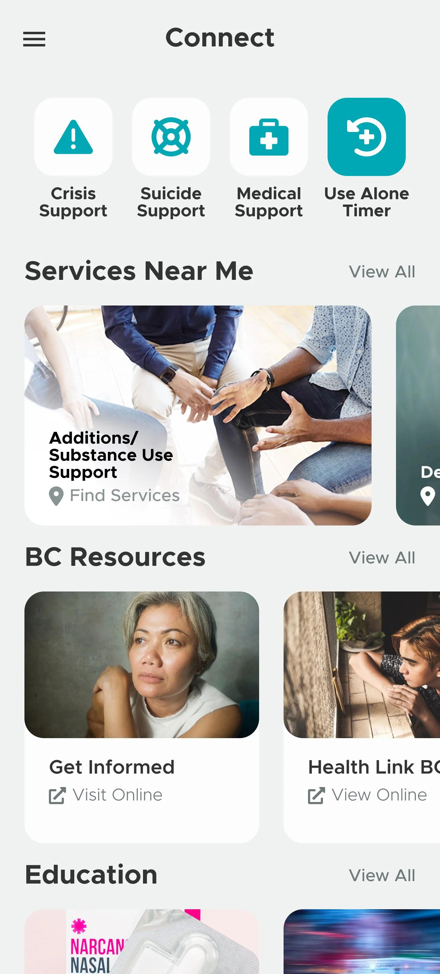
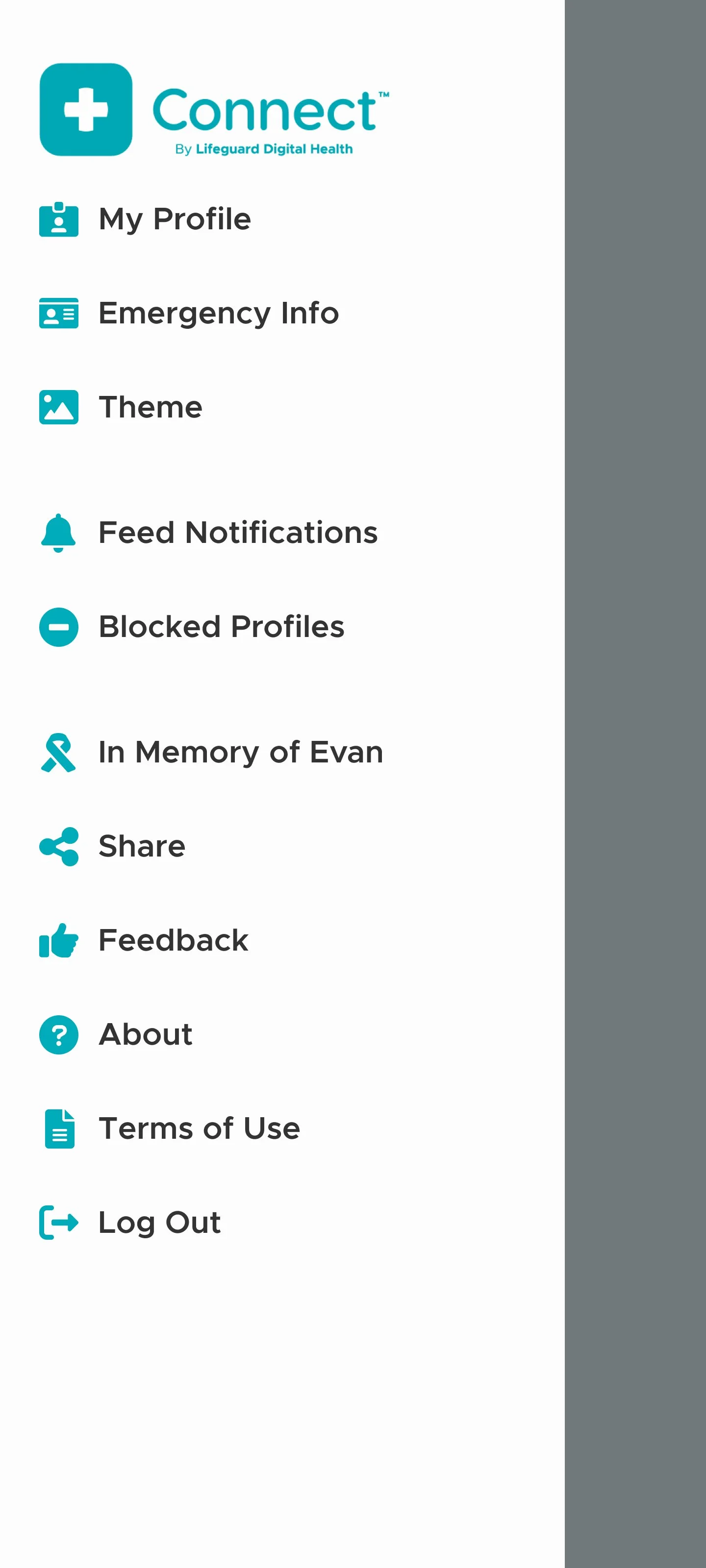
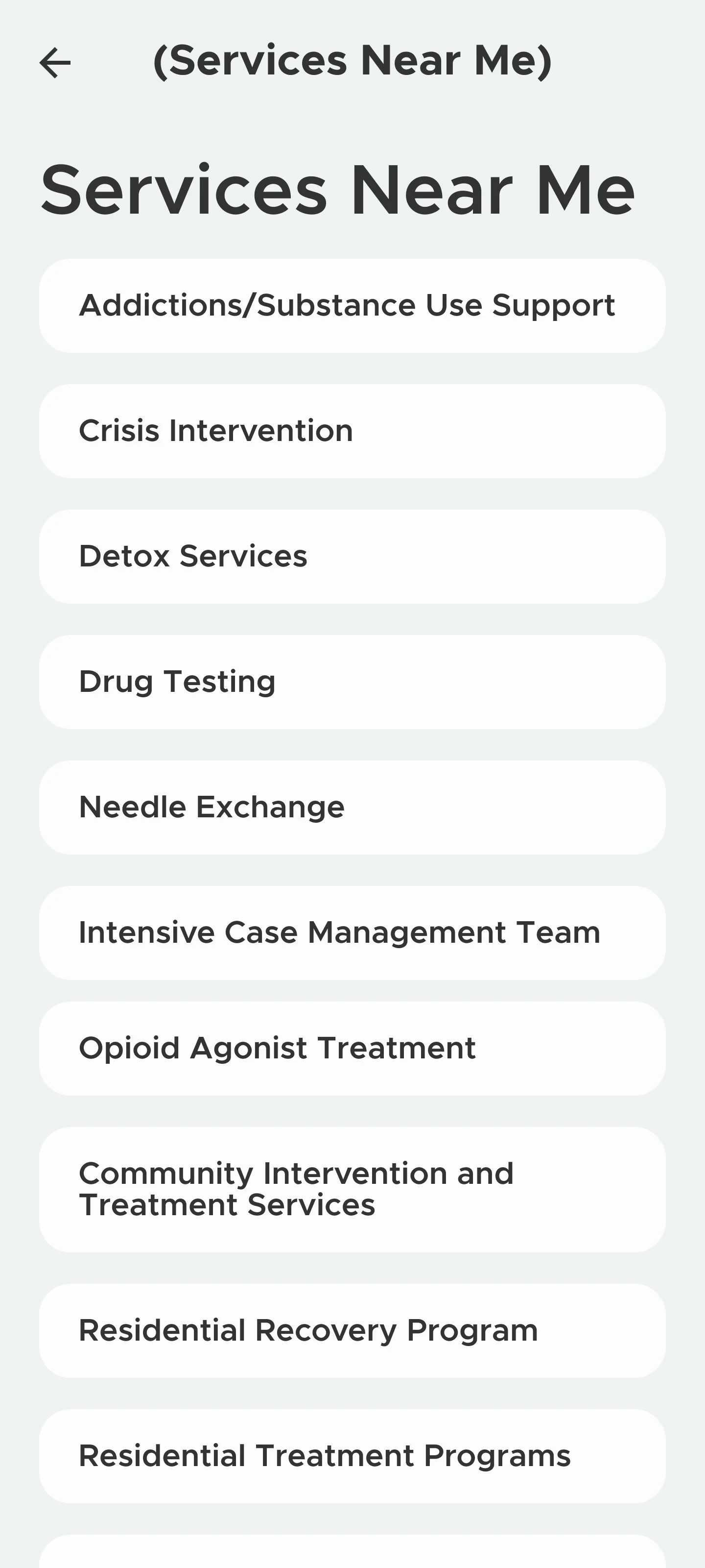
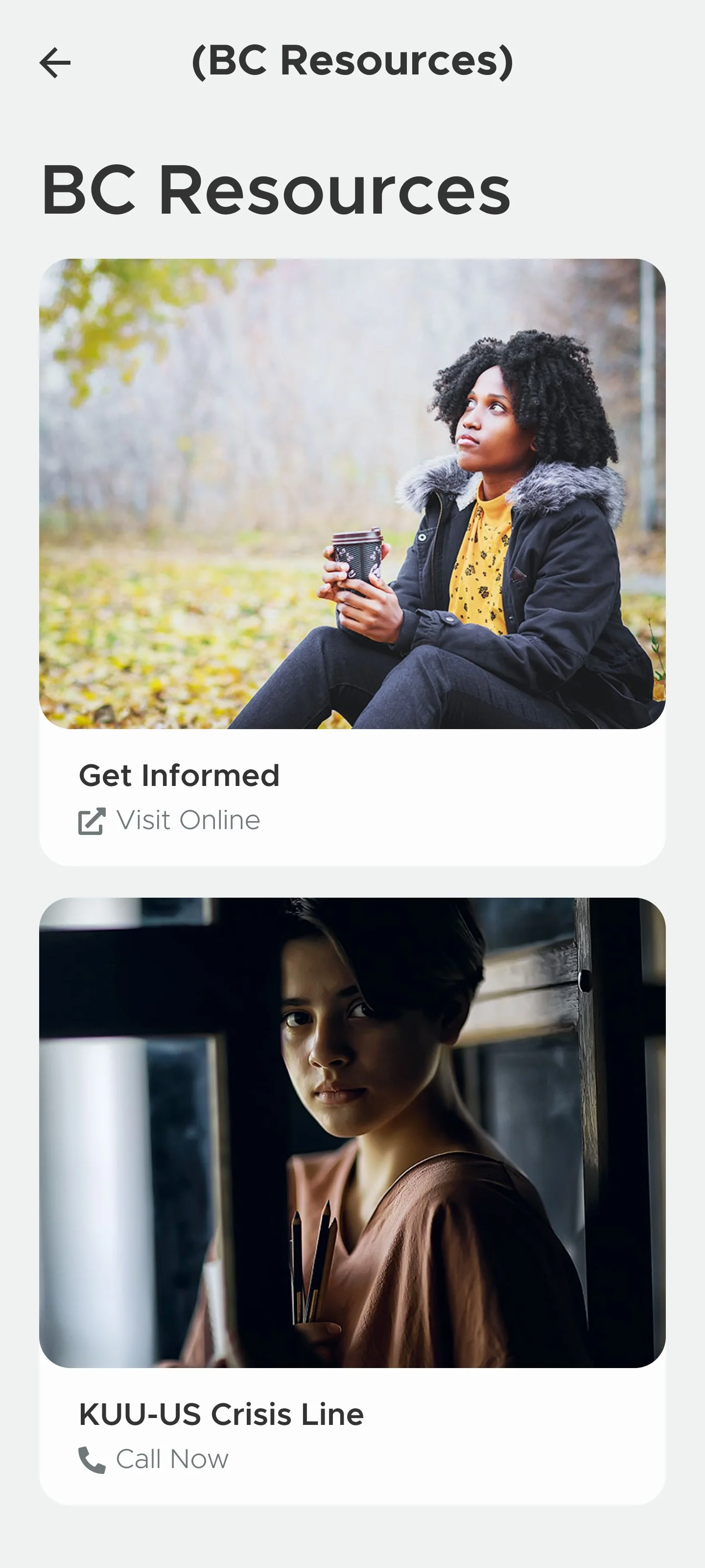
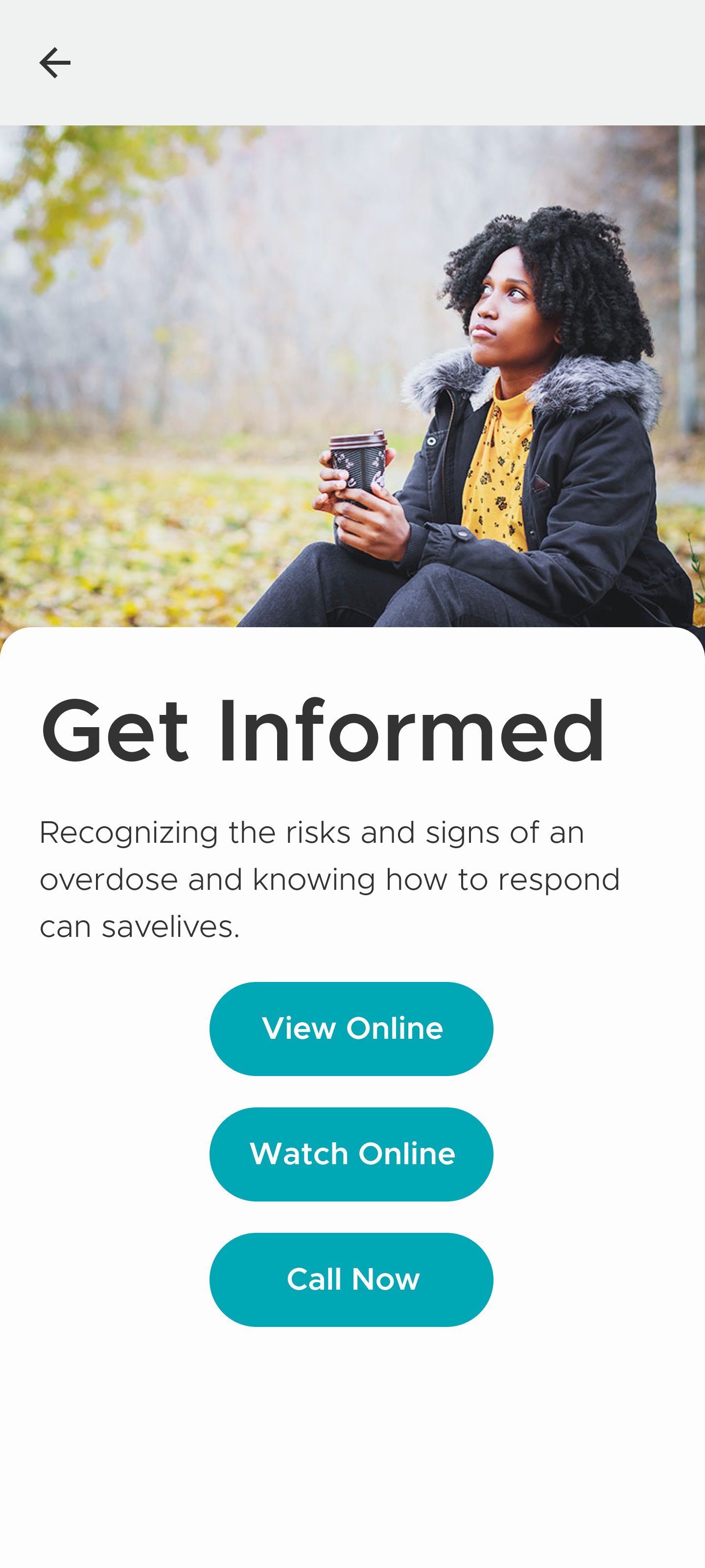
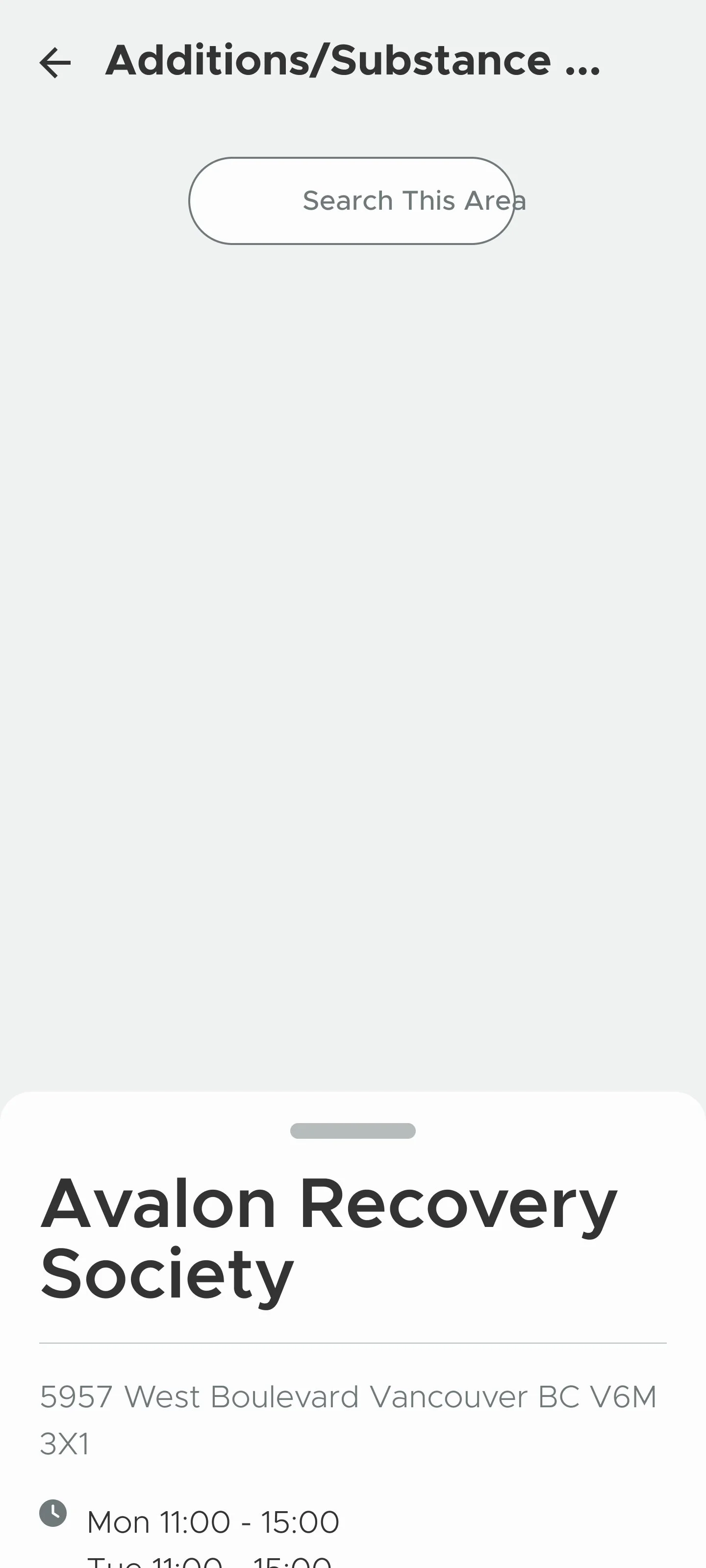
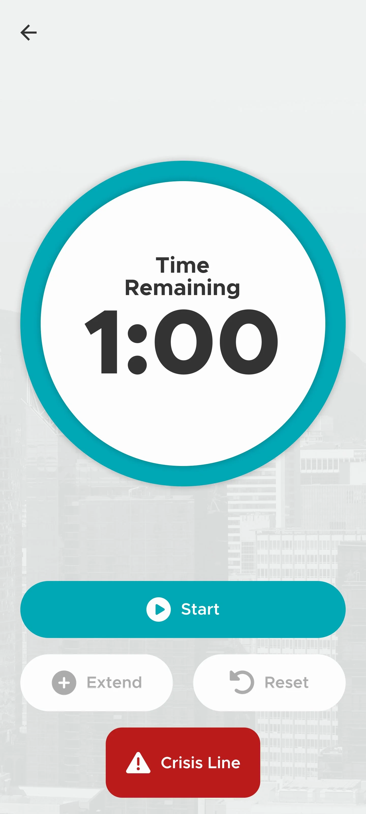
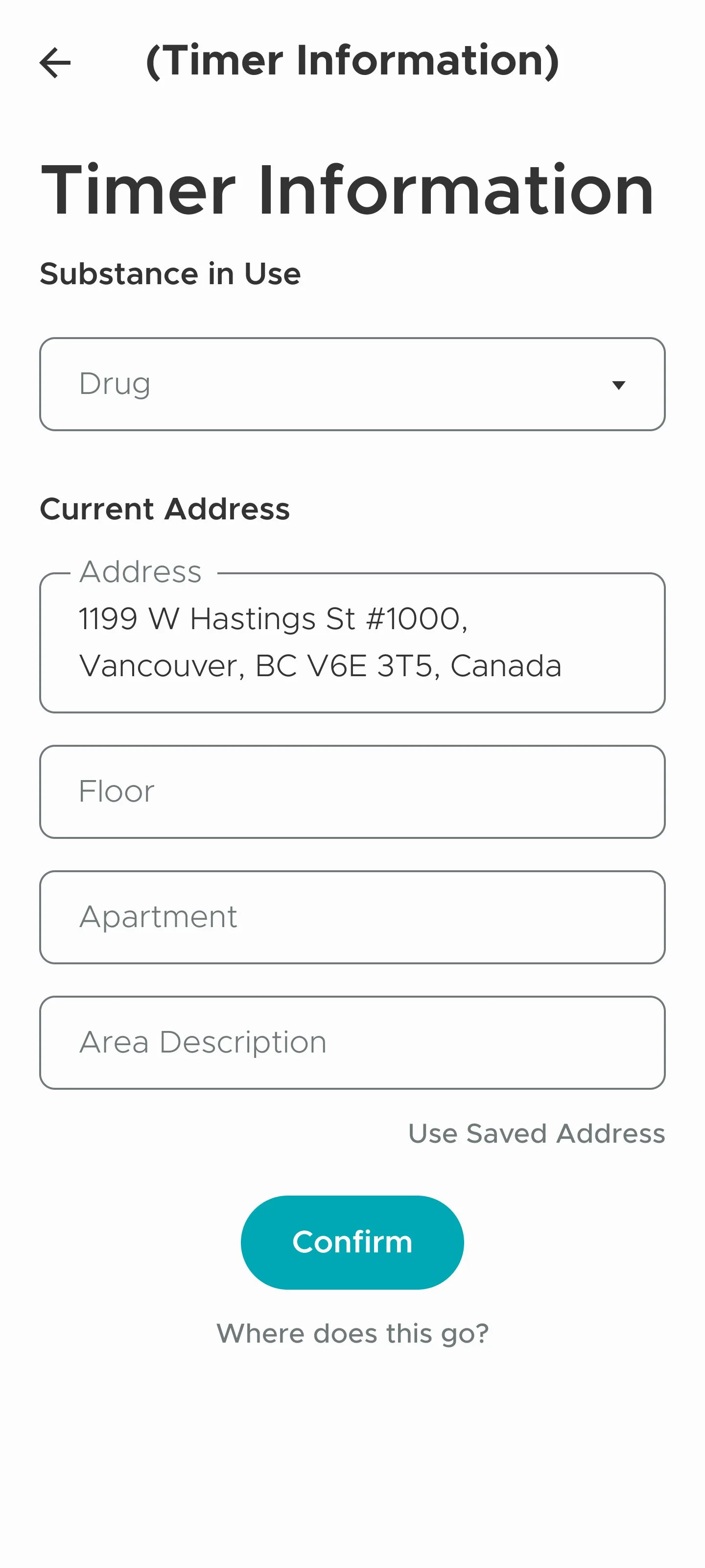
Based on two rounds of user testing, I made plans for restructuring task flows and simplifying the UI
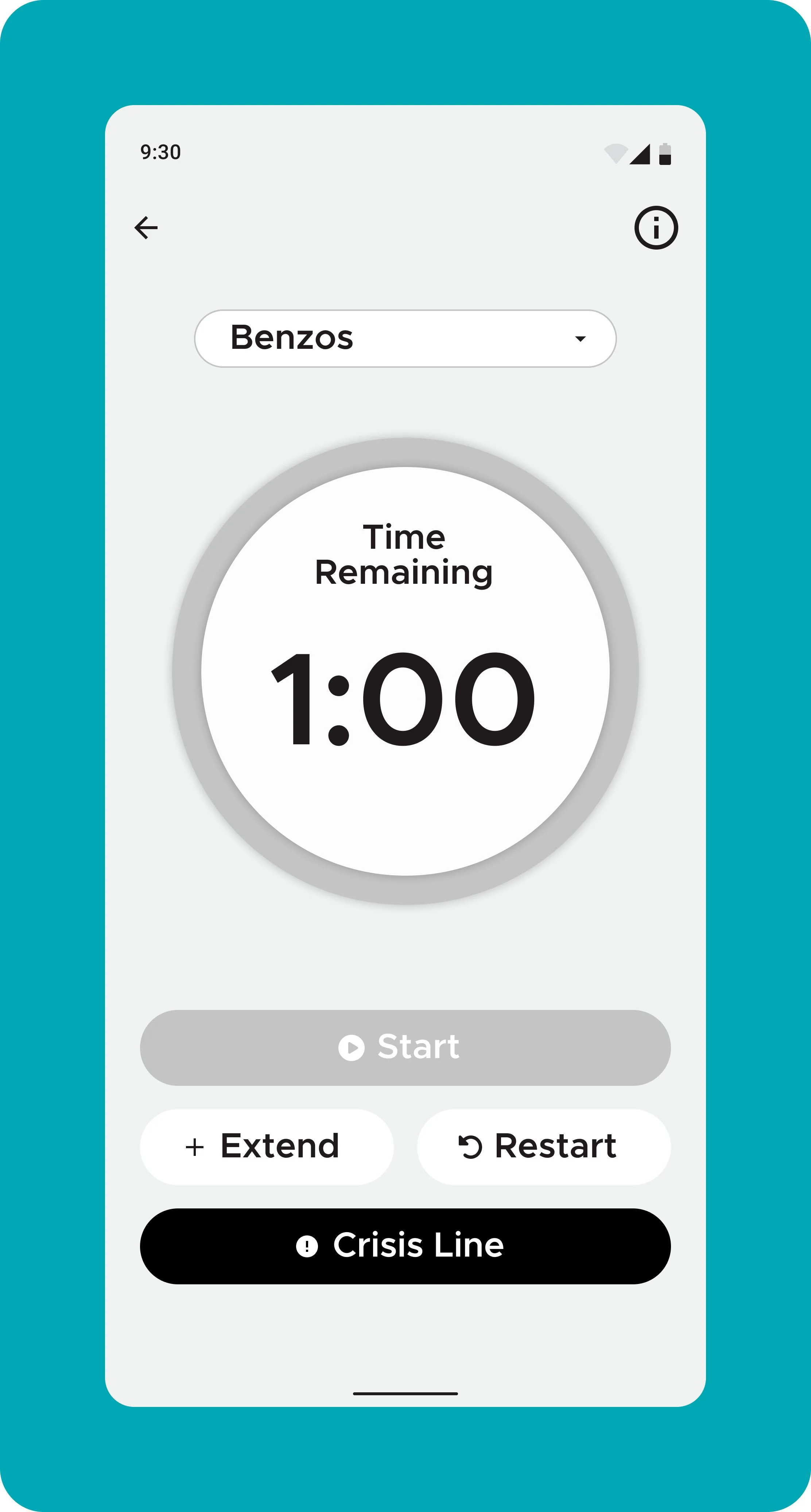
1. Simplify ‘Add Address’ flow in Use Alone Timer section
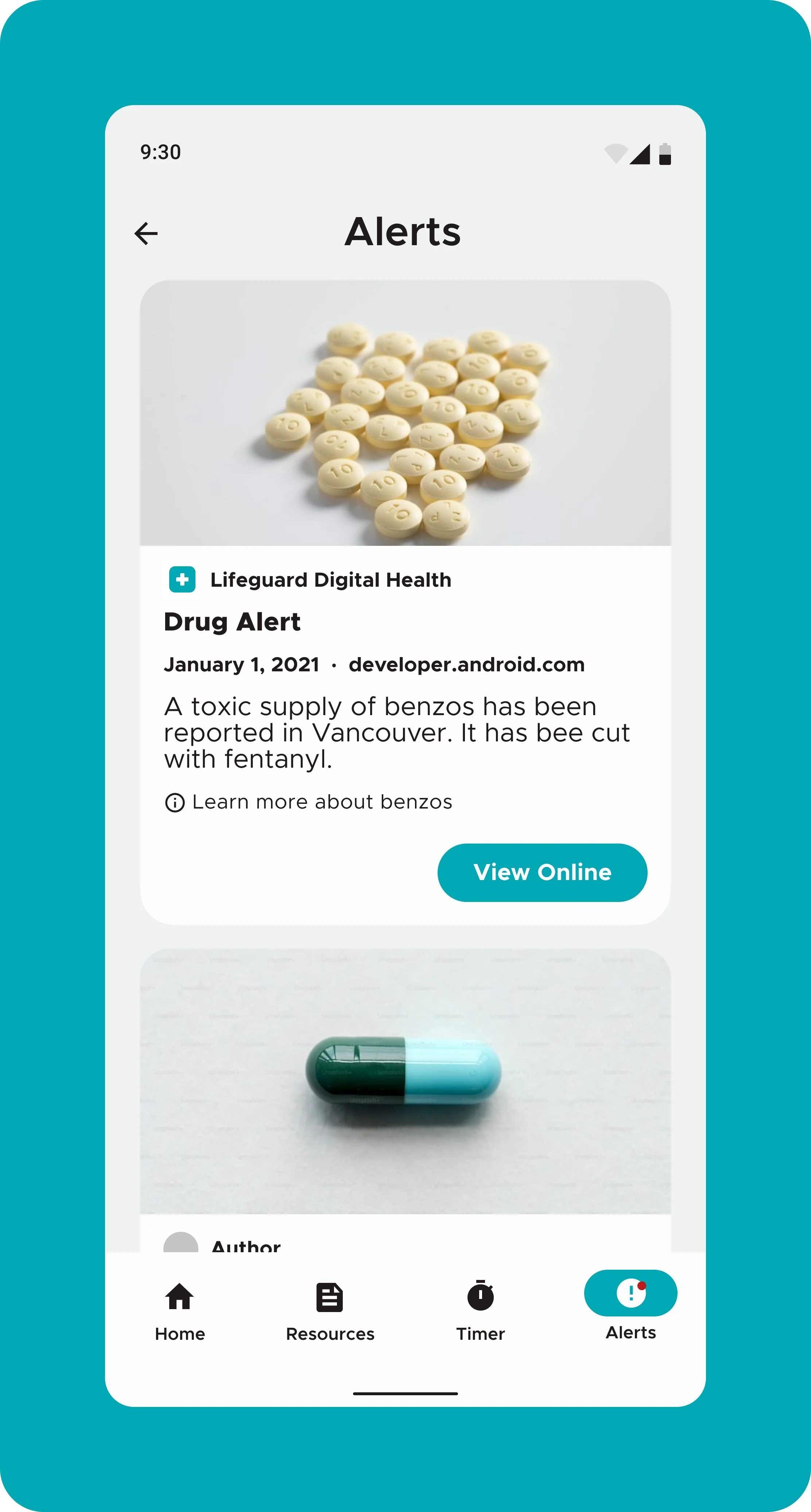
2. Emphasize drug alerts throughout app
3. Remove unnecessary and unused features
4. Add and emphasize help and documentation
5. Simplify onboarding flow
6. Clearly communicate privacy and data policy
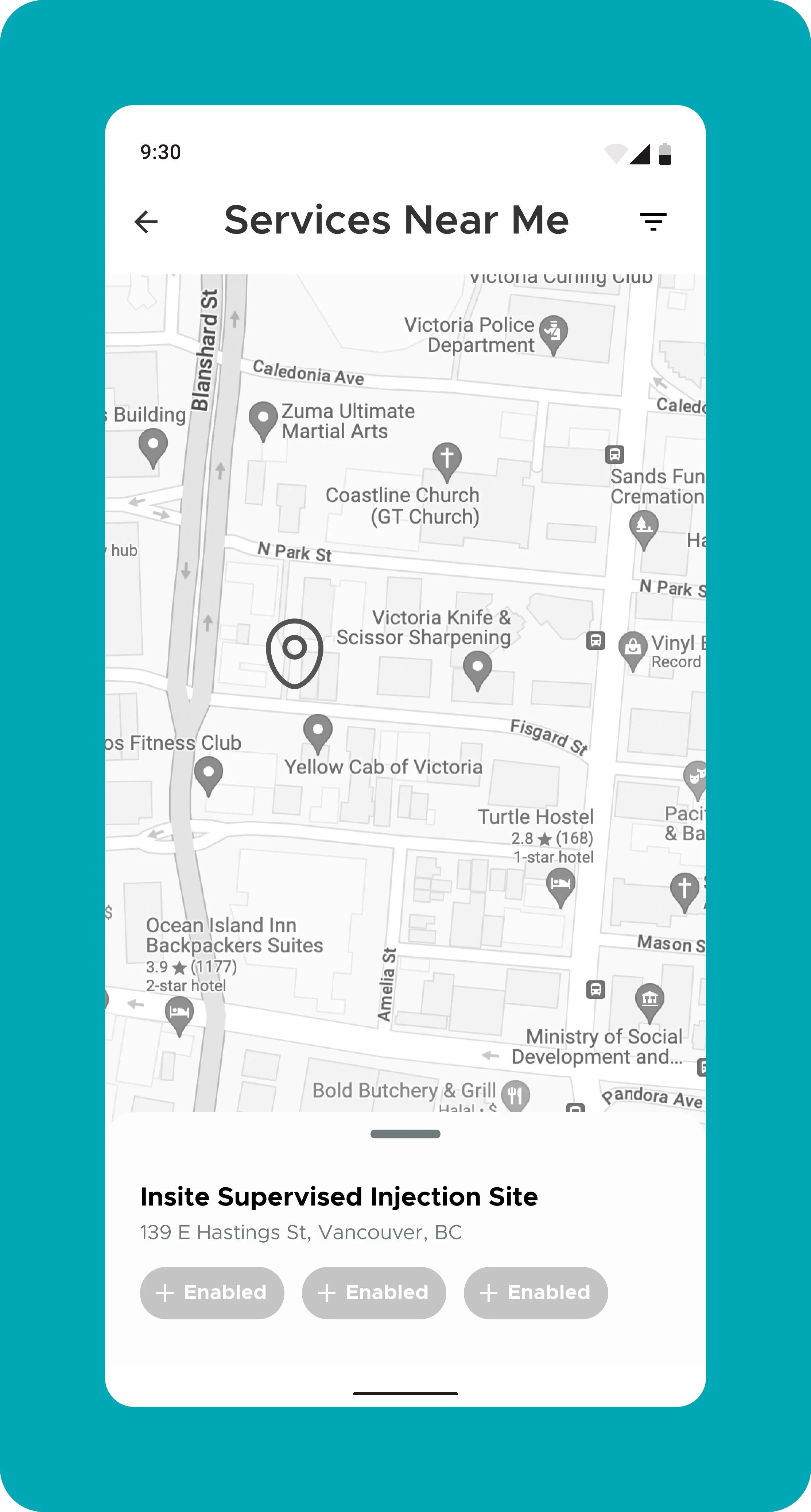
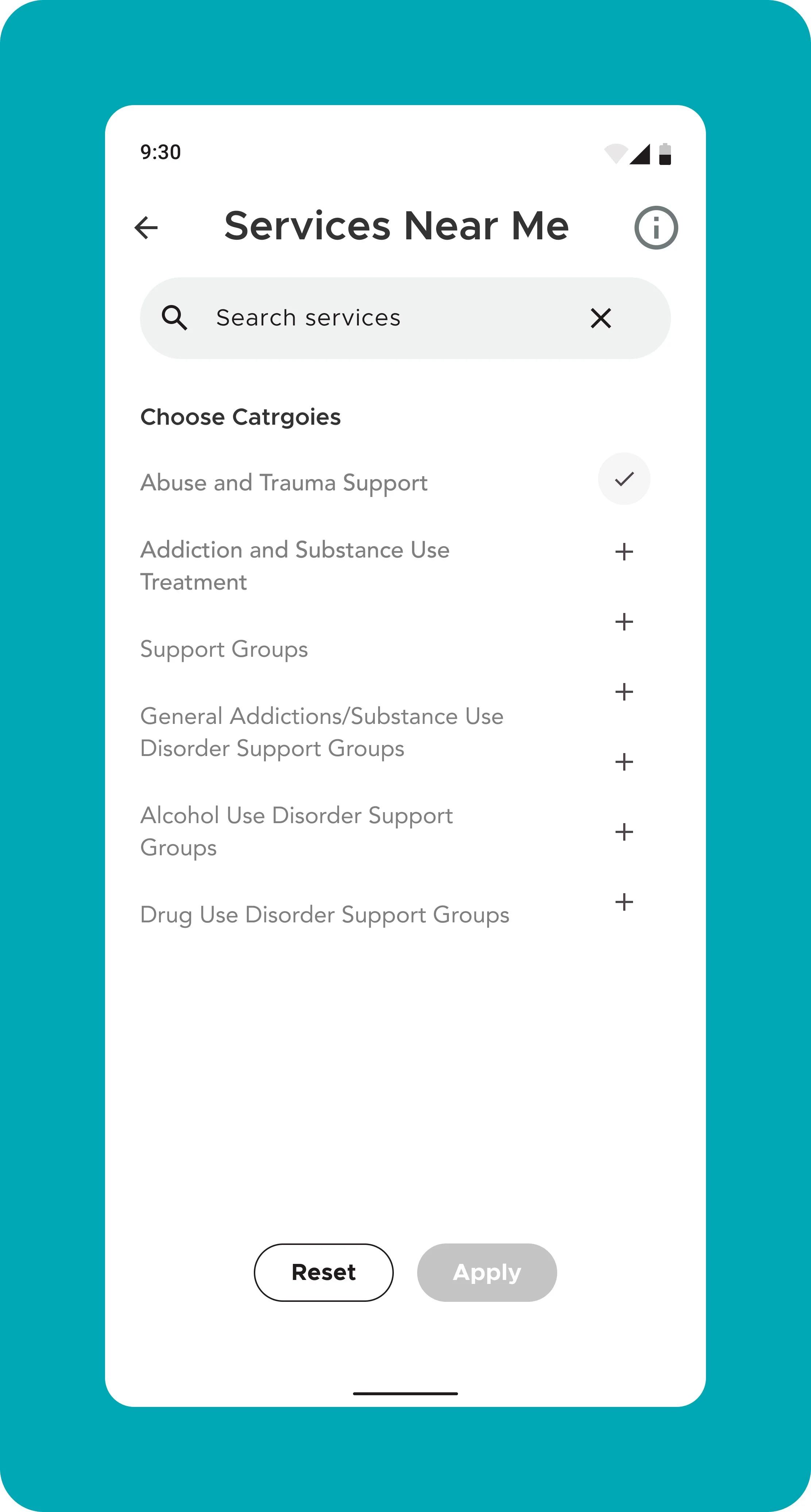
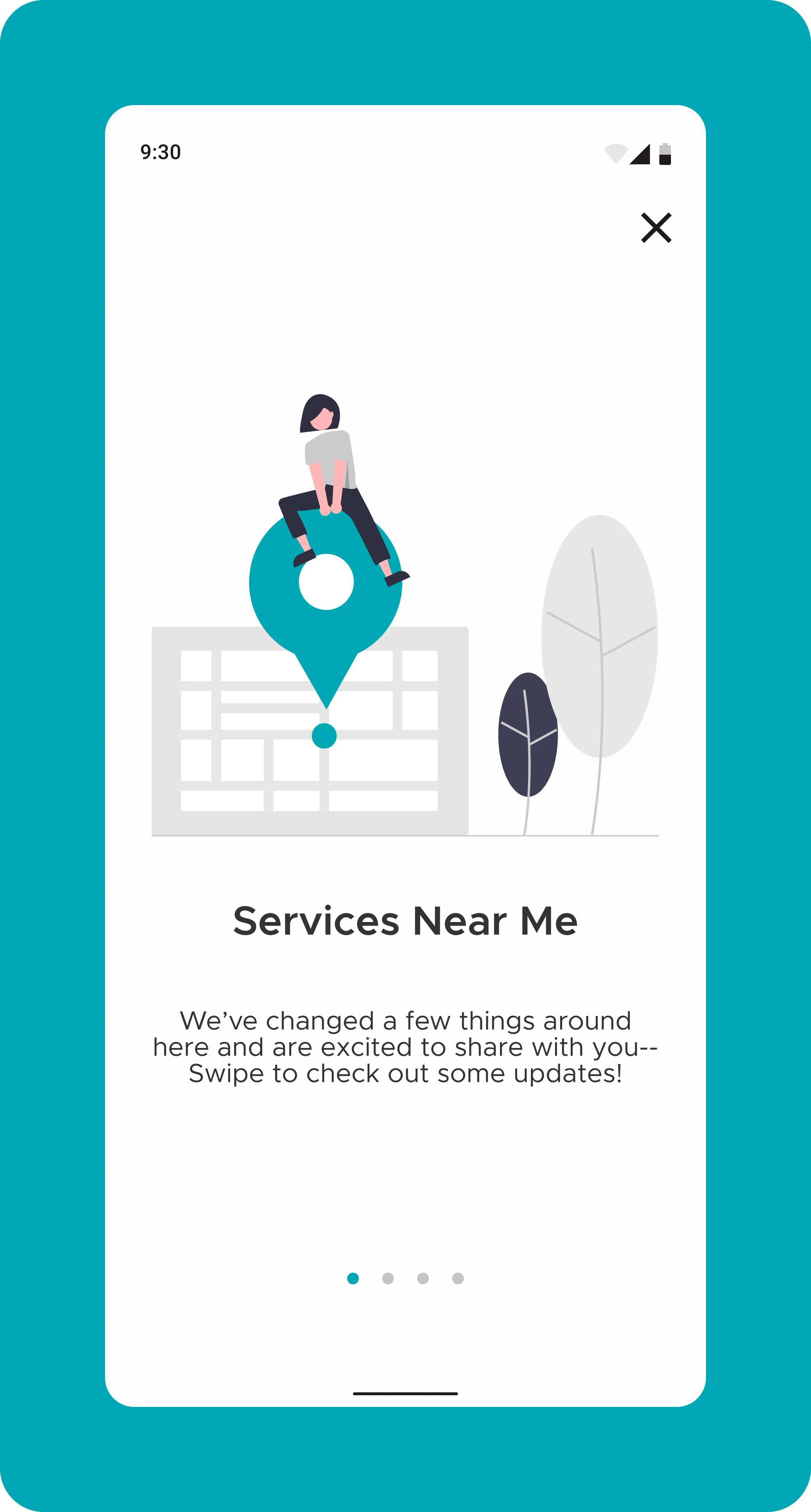
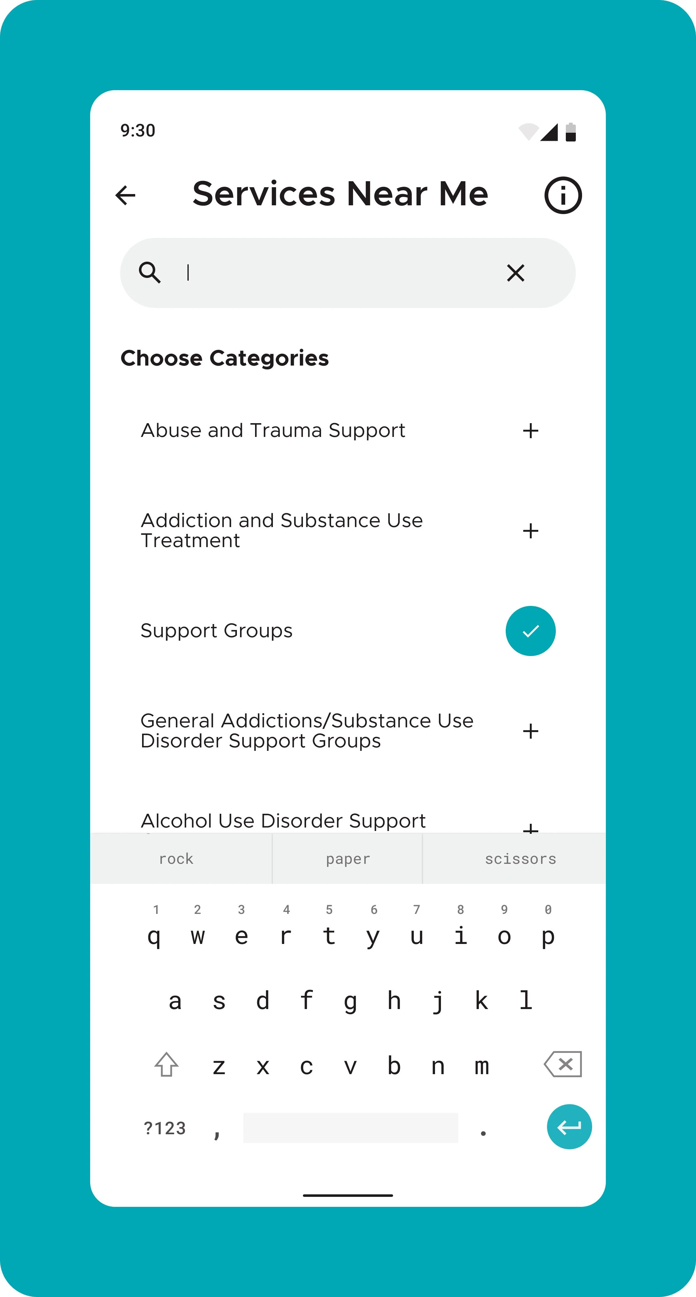
7. Add search filter function to Services Near Me section
USER TESTING

SKETCHING
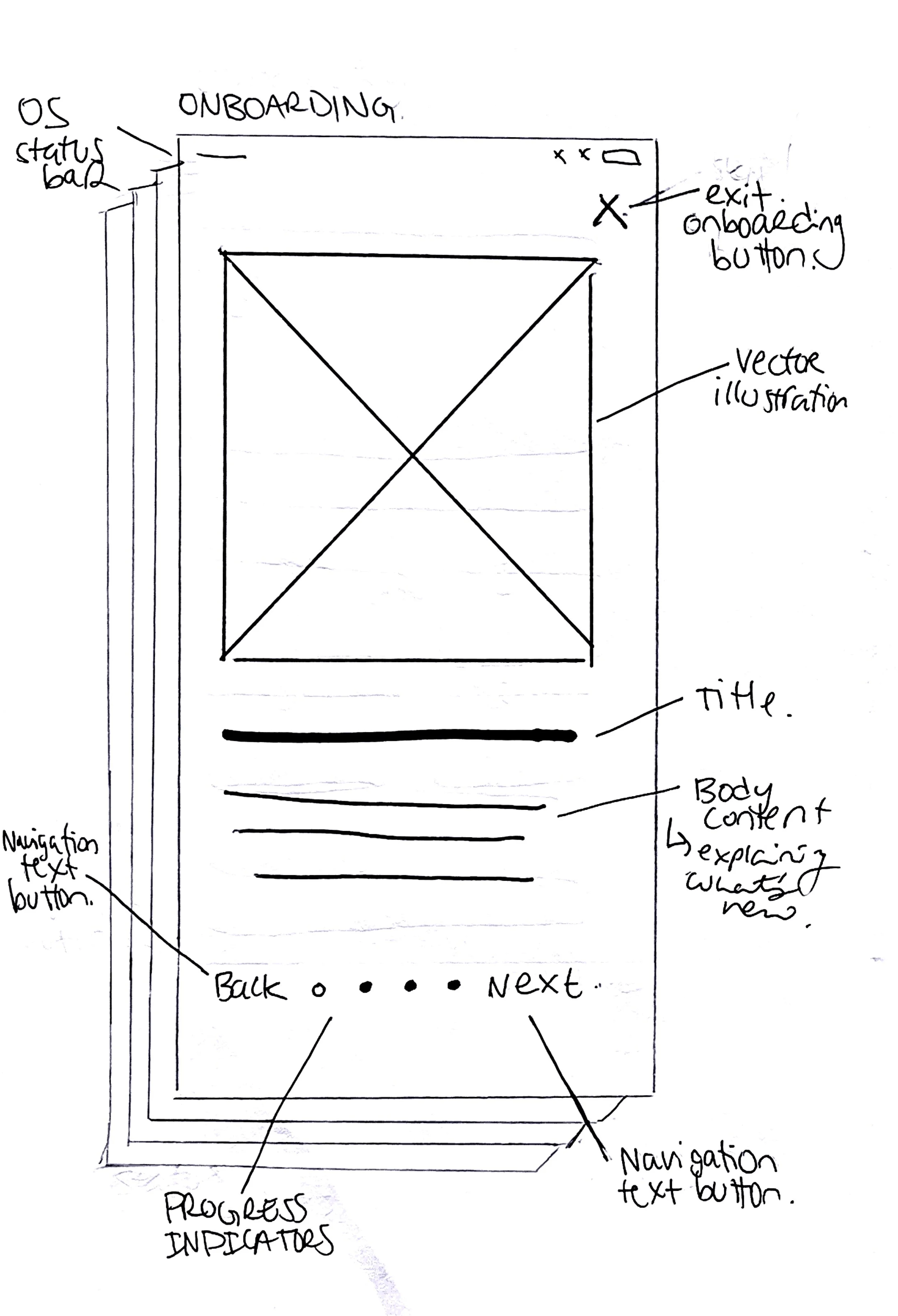


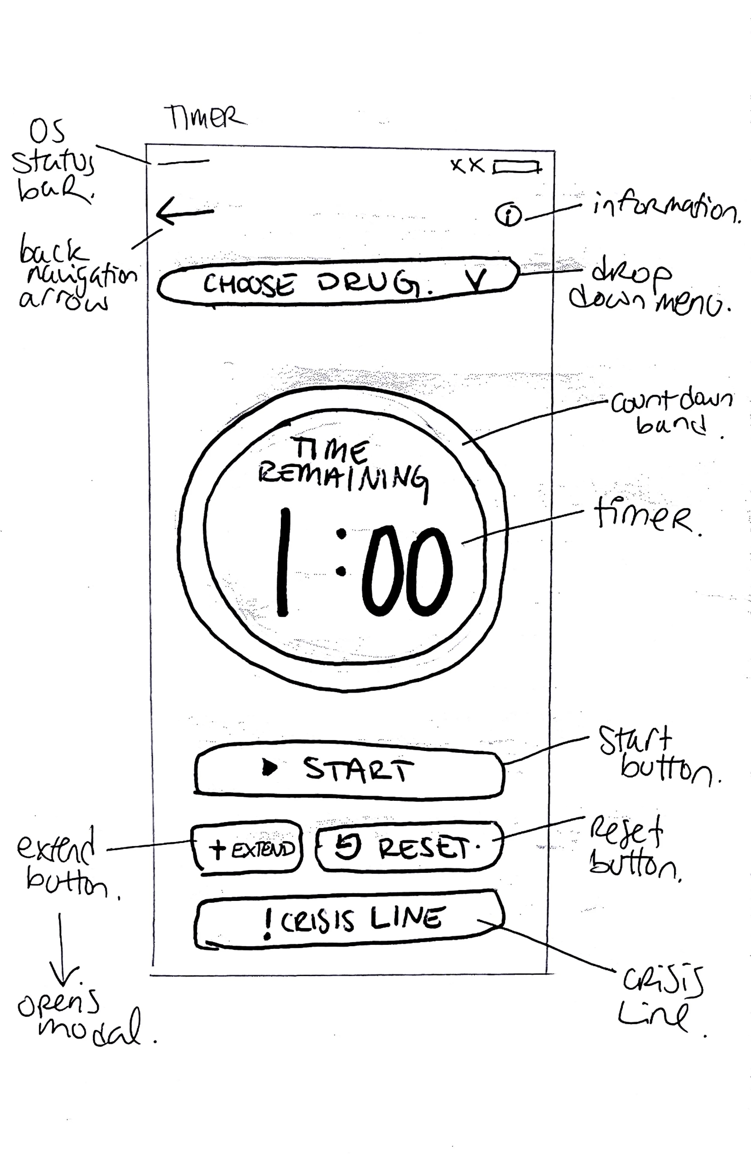


WIRE FRAMING
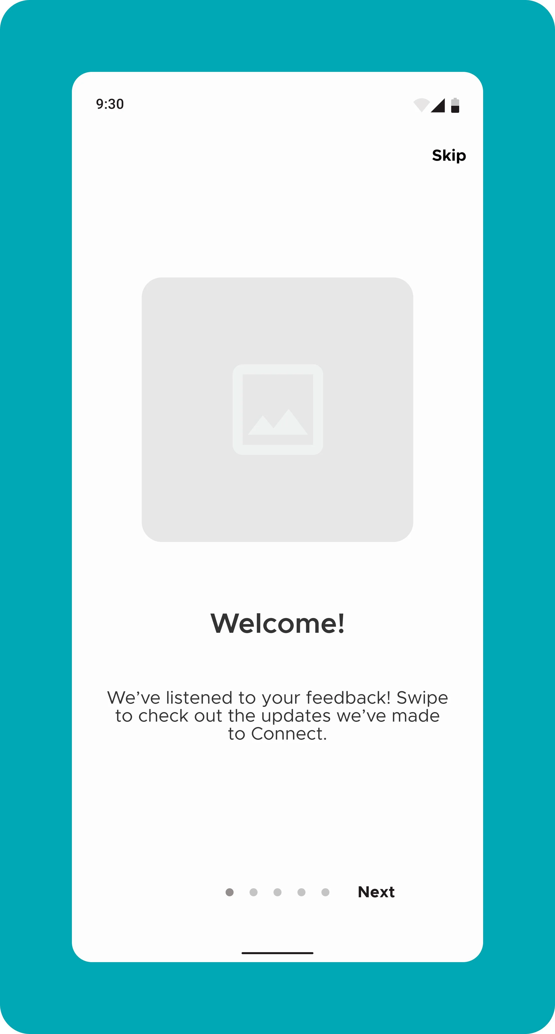
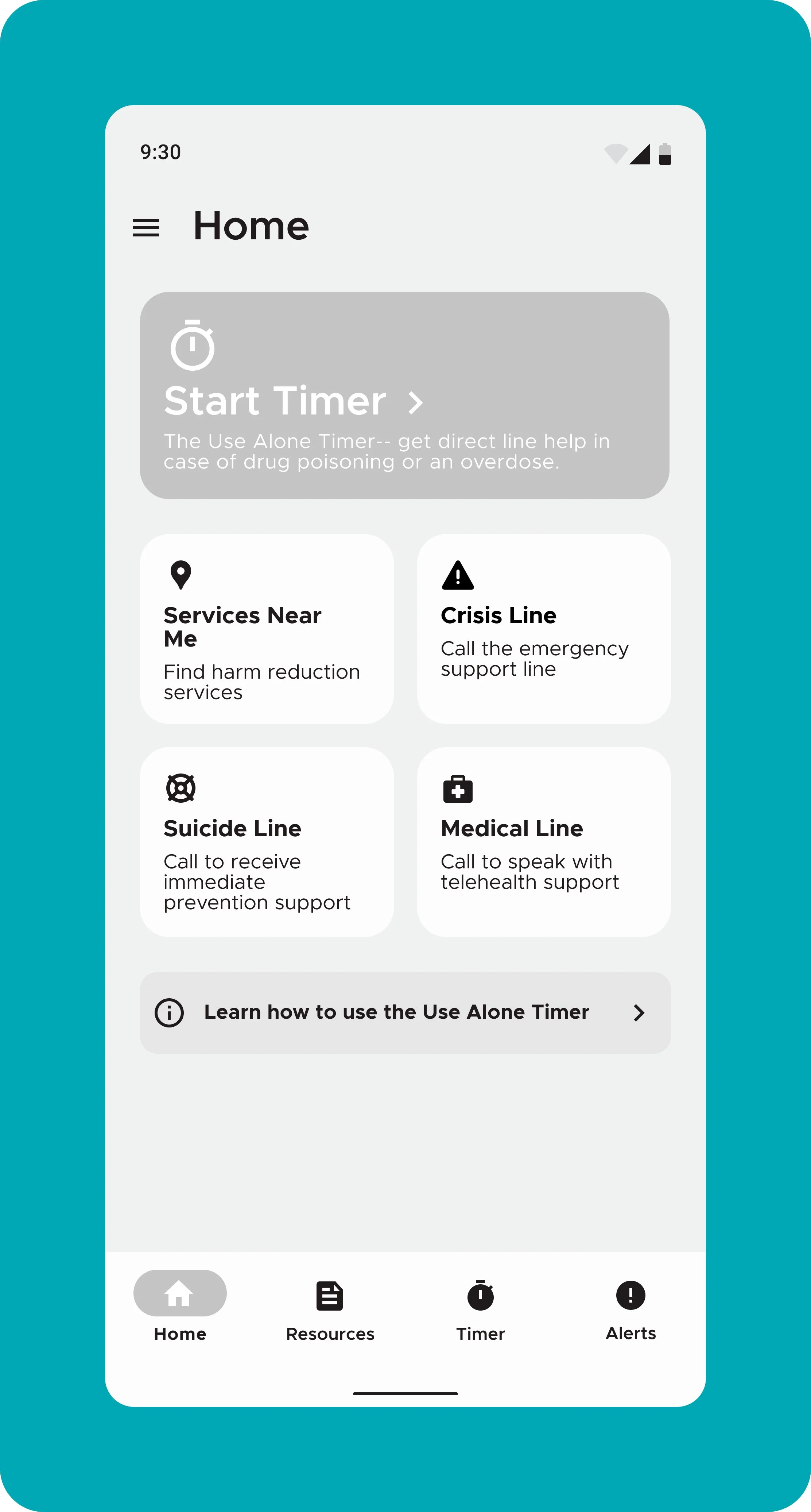


DESIGN SOLUTION
LifeguardConnect Version 6
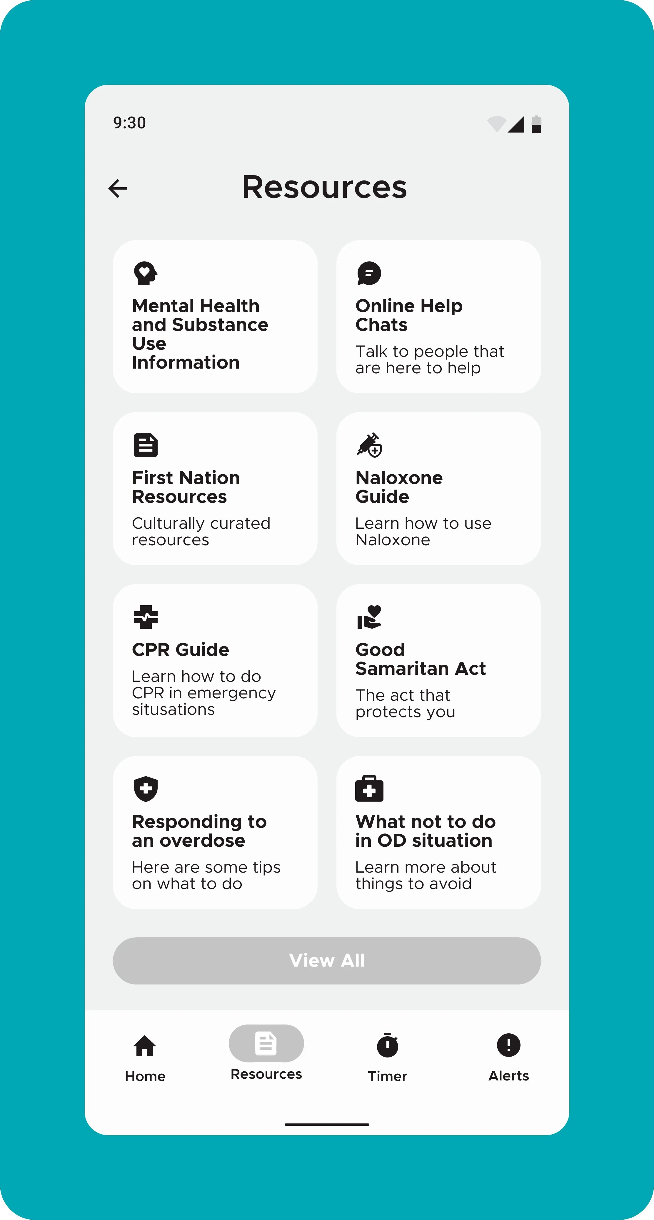
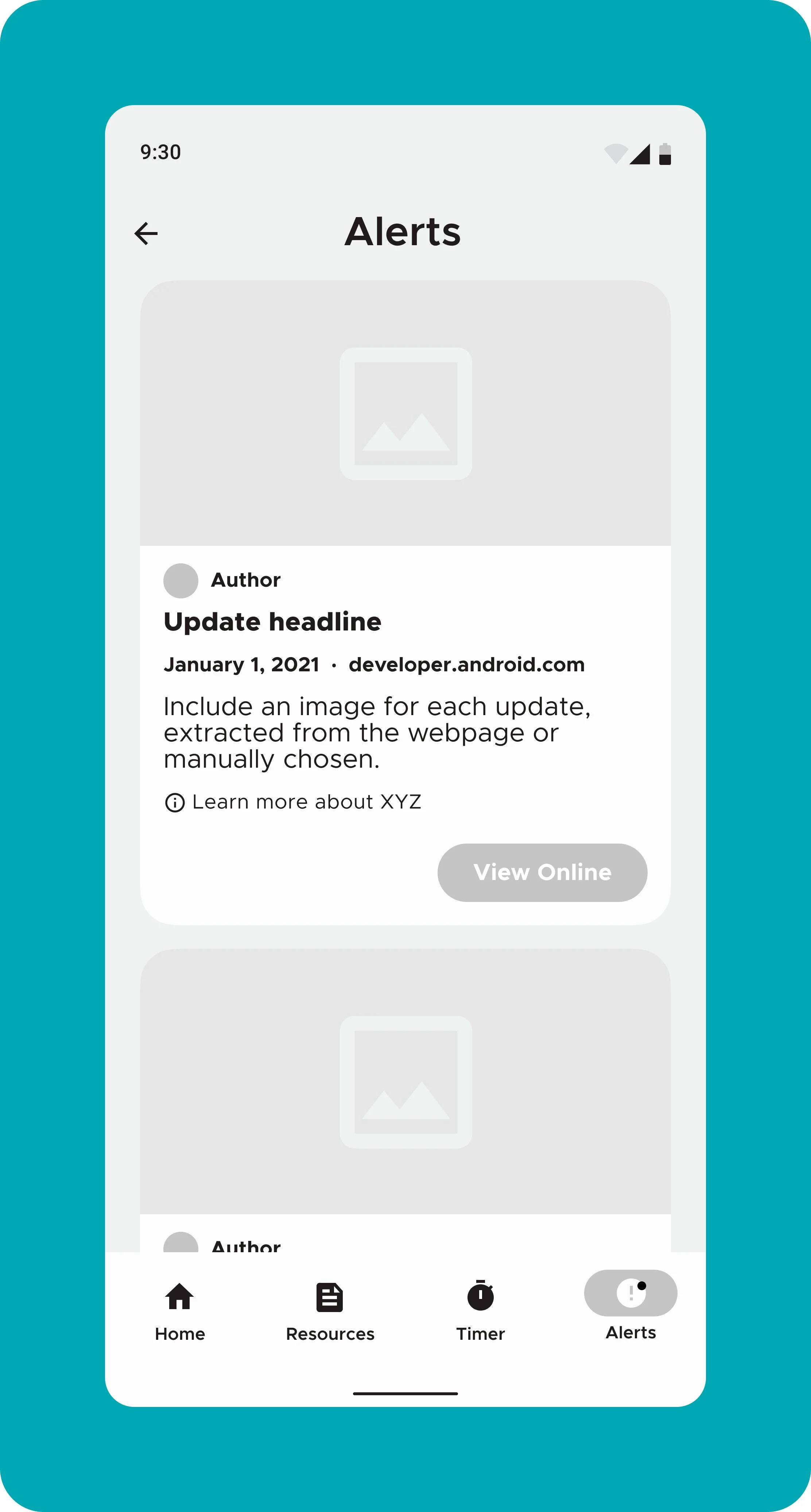
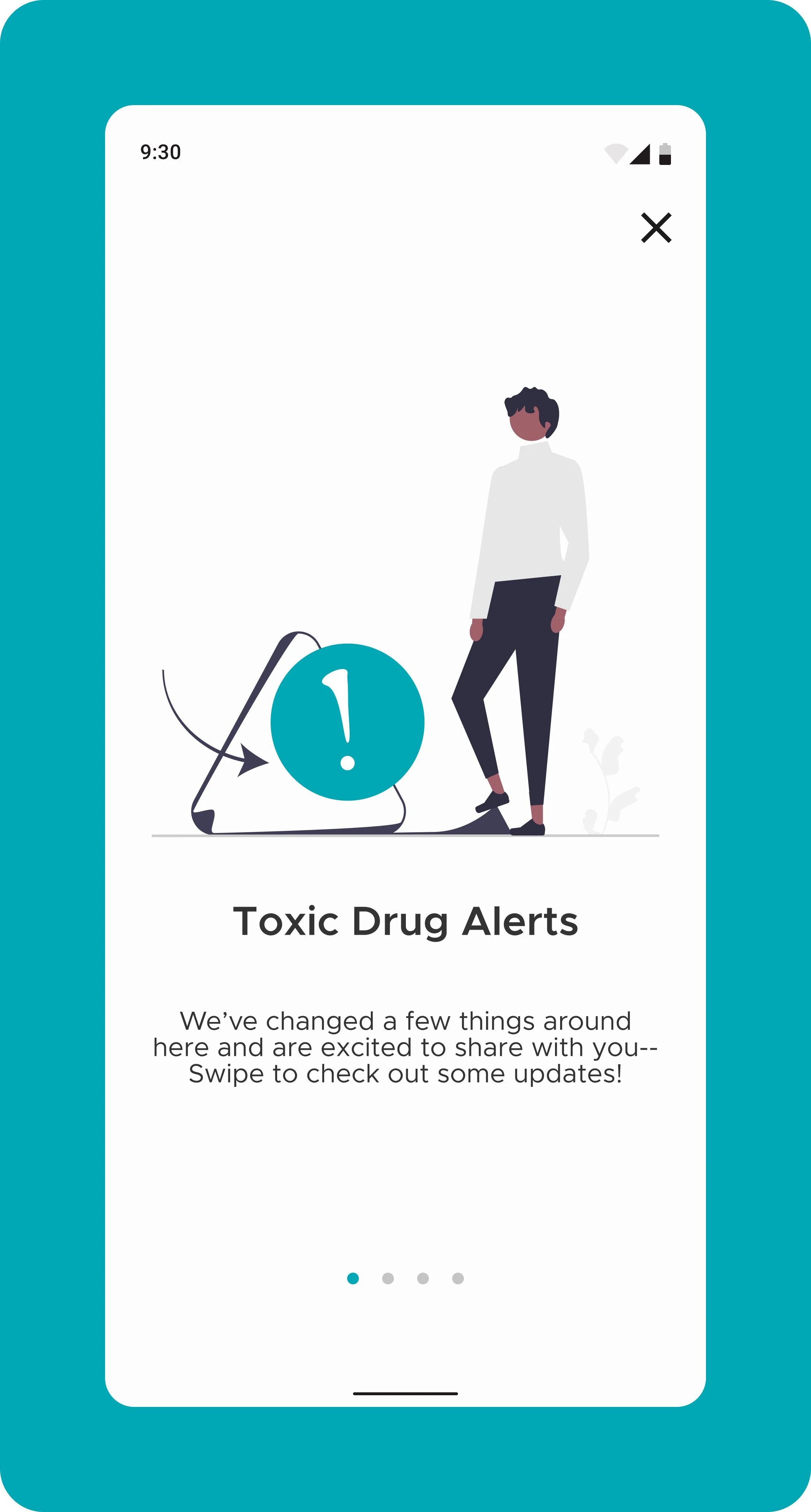
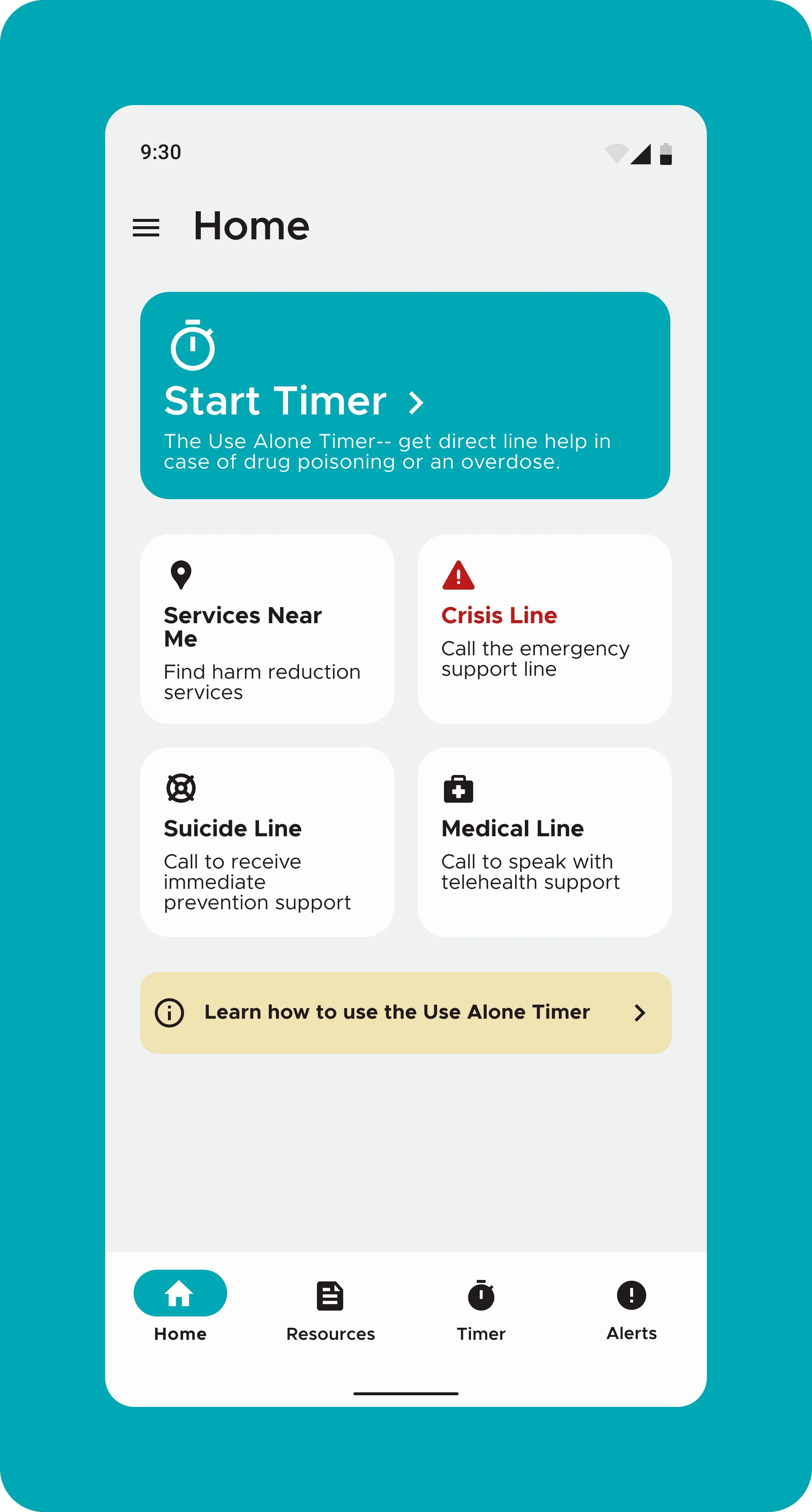
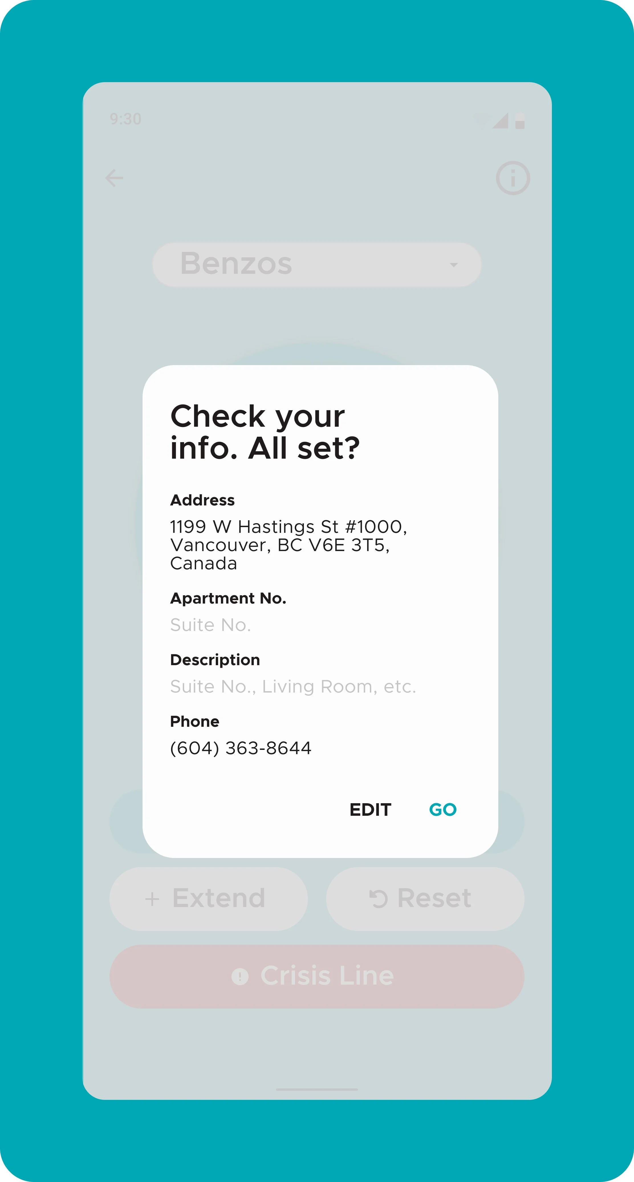
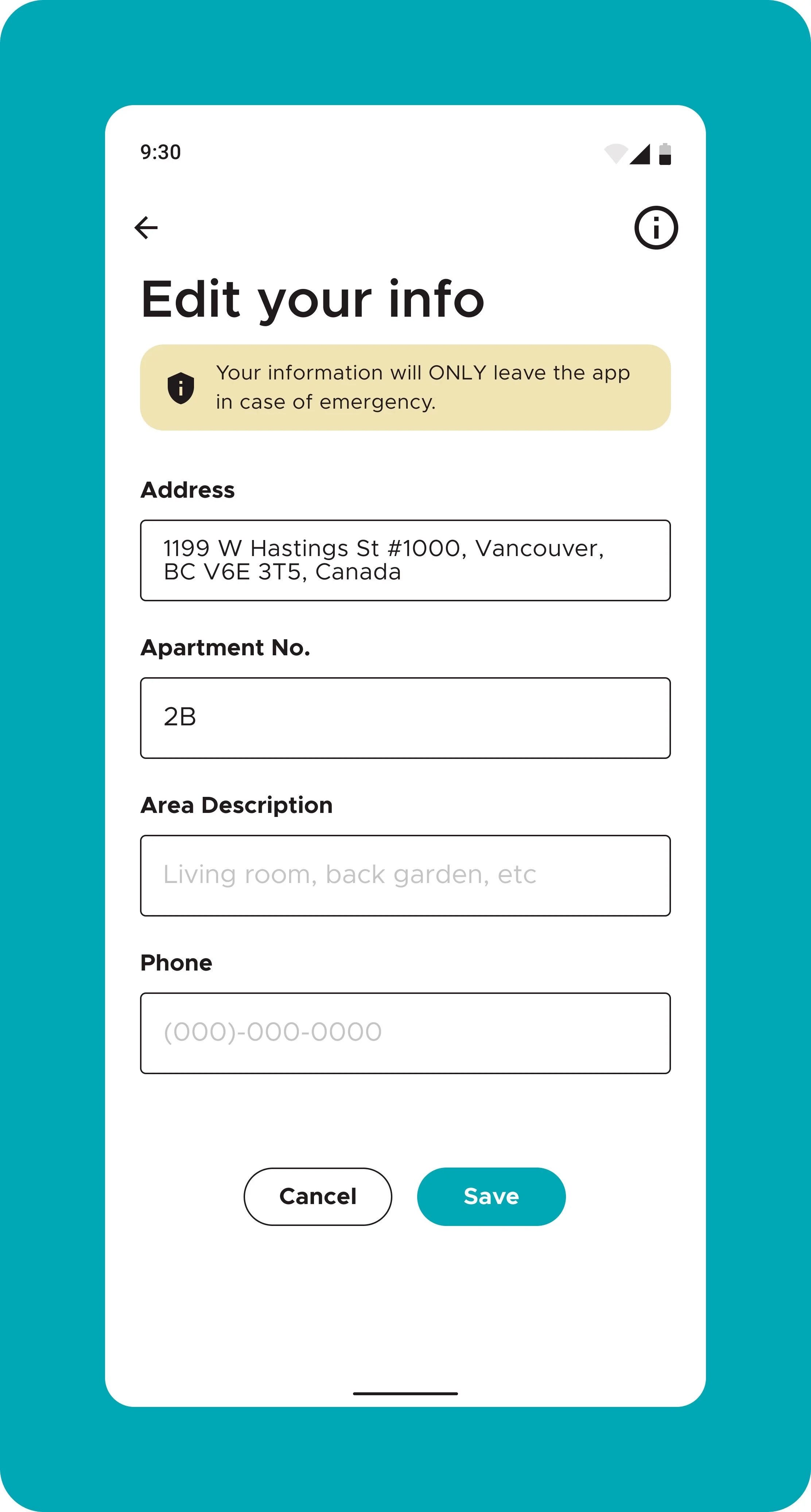
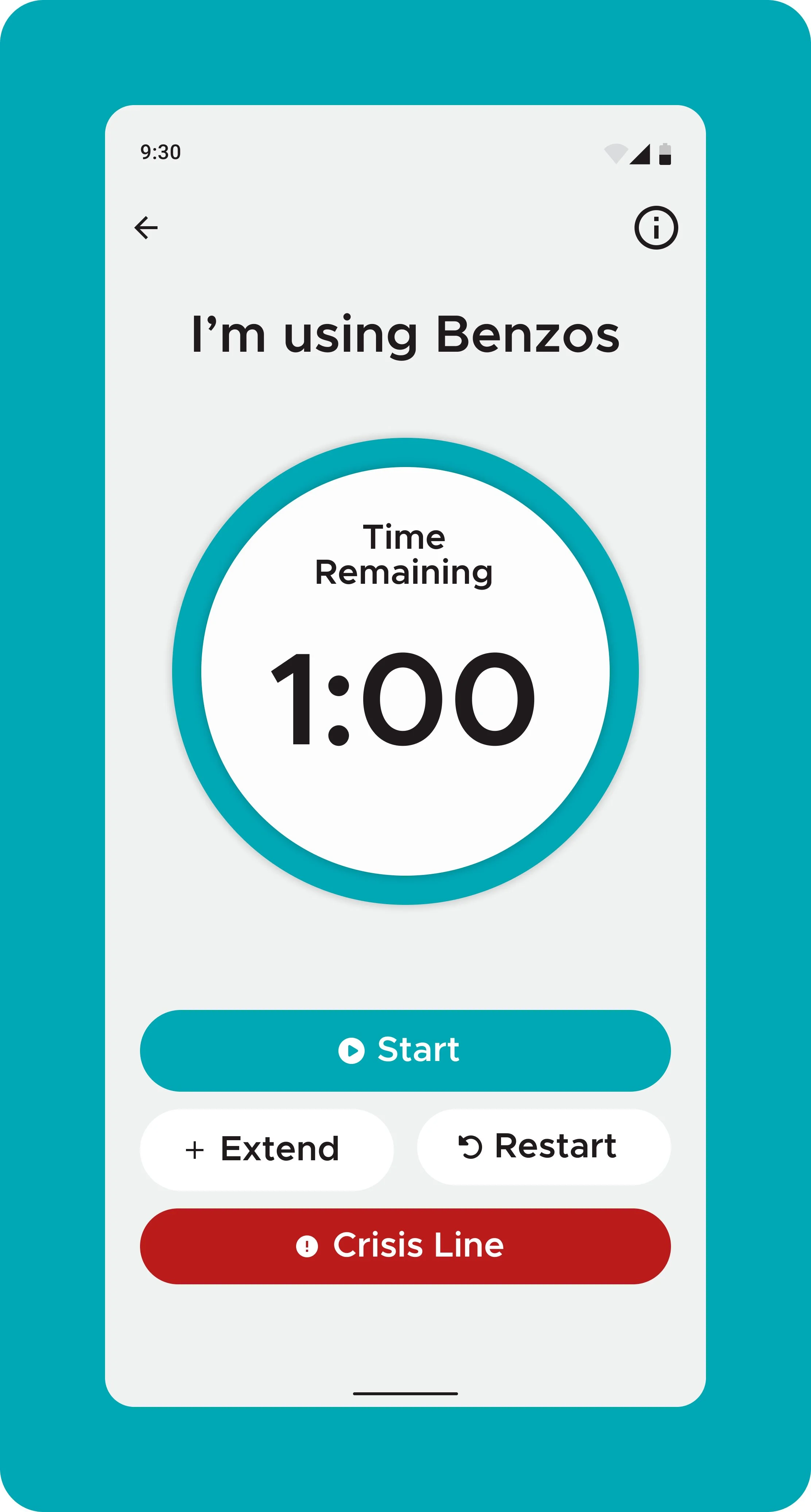
Introducing LifeguardConnect V6— now better than ever! We’ve streamlined the app to focus on what’s needed most, offering quick access to essential resources. Enjoy an expanded and improved search experience, with resources organized for easy navigation. Reliable features like the emergency timer and alerts are now even easier to use. Built with enhanced security and privacy, LifeguardConnect™ V6 provides the best user experience yet.

LifeguardConnect Redesign







IMPACT & FUTURE THINKING
Through the research process, I determined that the end-users wanted discretion, simplicity, clarity, and practicality. I used this to guide my design choices, focusing on simplifying the app’s information architecture and removing unnecessary features. I included documentation on how to use the key features, transparent and easy to find descriptions of data usage, and emphasized the most practical, life-saving harm reduction features in the app’s UI and task flows.
The redesign had a great impact on our end-users!
Impact
-
After the launch of the redesigned app, user retention rates improved by 40%, with users citing the app’s simplified design as major factors in their continued use.
-
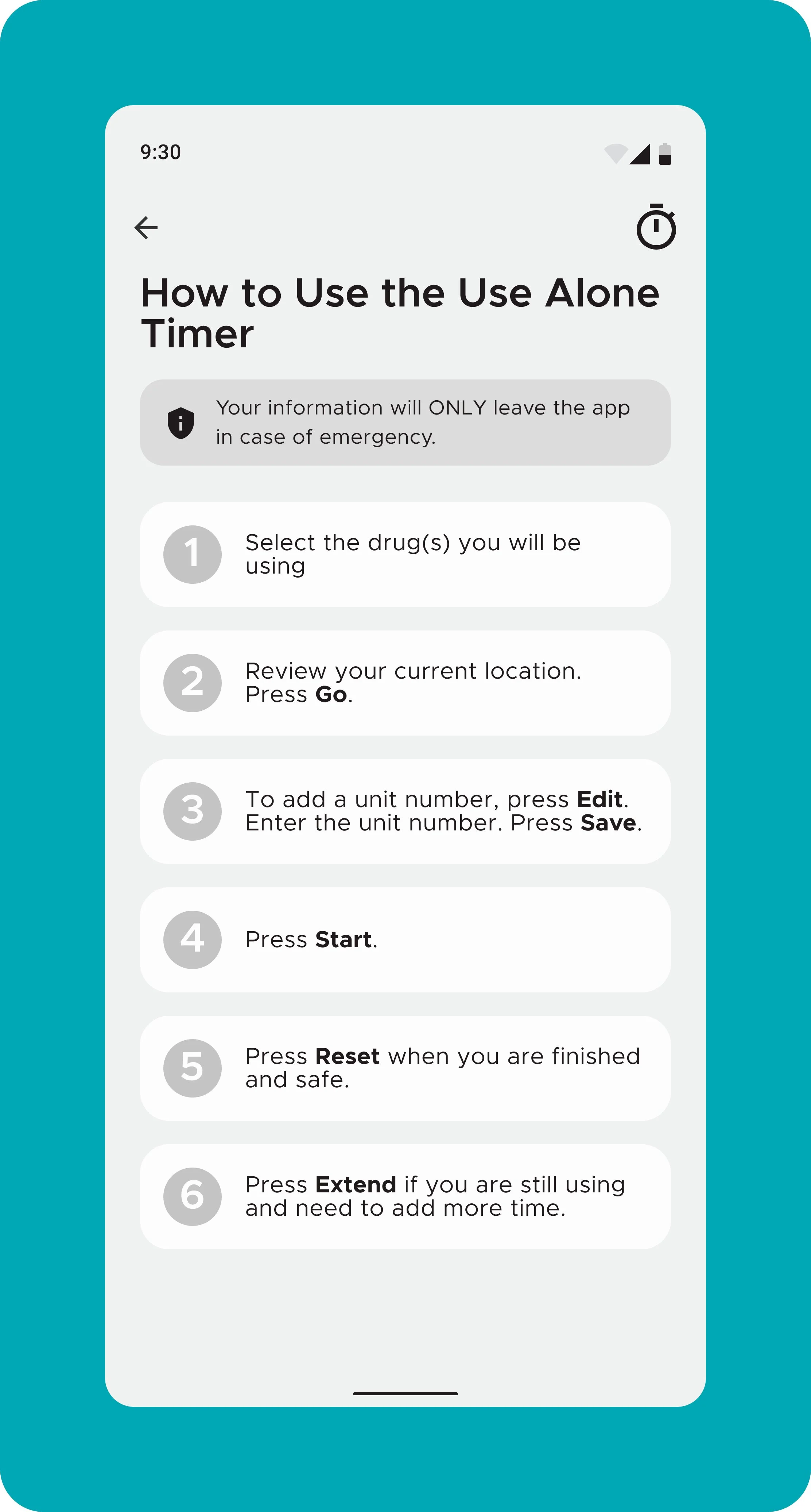
Nearly 60% of users reported improved usability and ease of use with the Use Alone Timer feature after the task flow was simplified, and how-to documentation was provided
-
End-users reported feeling more confident that their anonymity would be respected when using the app.
Feedback from users indicated that the inclusion of Lifeguard’s privacy and data collection policy in prominent areas of the app, written in plain language, and transparently showing its methods created greater feelings of trust.
The LifeguardConnect App redesign is a testament to the power of human-centered design, especially when working with sensitive topics like substance use. By combining usability, accessibility, and empathy, the app has provided individuals with the tools they need to successfully reduce harm in their substance use habits. It also enables healthcare professionals to offer better, more timely care. This project has deepened my understanding of designing for health, wellness, and safety, and I am proud of the positive impact it has had on its users.
What’s Next?
-
This project allowed me to explore the intersection of user experience and substance use, which was both challenging and rewarding. The key takeaway was the importance of designing with empathy—particularly for users in vulnerable states. Ensuring that the app was not only functional for those using it while sober, but also those who may be in an altered mental state pushed me to implement accessibility standards beyond what was readily available in industry standard guides. This was vital for ease of use, and also helped to create a nonjudgmental space, improving user engagement and retention.
-
Looking ahead, I would continue to iterate on the design by:
- Revise the home screen to have a balanced information architecture with fewer calls to action, better utilizing colour and white space
- Continue to conduct end user testing through various methods in order to collect a clear data set in which to present to investors— to provide evidence for design decisions backed by data, to continue to advocate for design decisions that benefit the end user, and promote a better balance between business aims and the physical and emotional safety of the end user -
As harm reduction services grow in Canada, so will business interests and opportunities. As a user experience designer and product team member, it will continue to be of the utmost importance to advocate for and empathize with the end-users’ needs, and center them in service and product design. Finding creative ways to meet business goals without compromising safety will foster exciting collaboration opportunities.